Designing the Corporate Identity
febbraio 2016

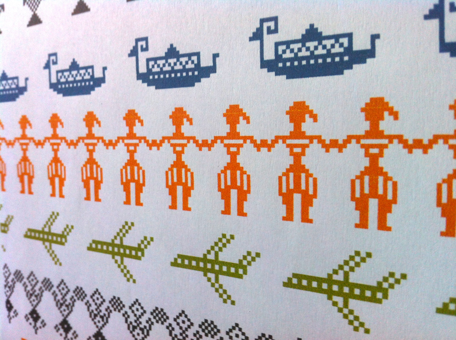
![]()
Guidelines for the graphic design for the Sardinian Region at the Expo, an equation between pixel and loom.
Bàttoro, Sardinia PB1, Sardinia dingbats: the names for three fonts developed for the new corporate identity for the Regional Government of Sardinia re-interpreting the weaving of local craftsmanship, and in particular the ‘bàttoro in posta’, originally used in Sardinian’s traditional saddlebags.
The typography is the result of a long study by Stefano Asili, where the equation between pixel and pibione, a local traditional weaving stitch has been developed along many different lines. The grid unit of Sardinian’s weave is associated with the pixel, which performs an identical function in the digital realm: this allows to connect the traditional technology of weaving with that of new media.


Re-designing the corporate image for Sardinia at the Expo has been an opportunity to connect these explorations with the new guidelines of an integrated system for marketing Sardinia as a a territory (originally designed by Pentagram in 2006). A meeting point is the square coloring and the orthogonal overlapping of square and rectangular shaped backgrounds, as specified in the manual. The corporate color palette base been enriched with hues from traditional costumes like those of Orgosolo and Bitti.


By operating repetitions, rollovers, and contrasts on the characters and the key decorative elements, we have obtained monochrome and color ‘iconic’ patterns. Some of which result from the ancient and well known, part of the local tradition (deers, peacocks, stars, the eight-pointed sun…) others are modern re-interpretations (airplanes, for instance), a third and last group of figures, although not part of the traditional repertoire of woven stylized shapes, is part of the imaginary traditional landscape of Sardinia (sheep, bronze figures, the ‘nuraghi’ pre-historic towers, and so on). In this track, the iconic domain can be endlessly extended to a wider visual vocabulary.
Along this track and referring to a common codex and expliting recursion allows to translate any figure to pixel or to ‘pibiones’ in a plausible way. The orthogonal module allows an infinite number of applications, either in two or three-dimensions. After having installed the fonts in a computer, is then possible too create new combinations simply by typing on the keyboard.

The result is a system that is practical, fun and highly expressive. The overall consistency of the temporary exhibit for Expo 2015, and its combinatory possibilities tested in that circumstance through the animated films, the graphic modules, and the development of Apps like Sardinia Typestry, proof how this structure is robust and fruitful.
On these grounds the corporate image of the Sardinian Region can find an identity that is modern but strongly connected with local tradition, profound in its elementary concept as light in its implementations.
Stefano Asili
Graphic Designer
Stefano Asili è nato a Cagliari il 18 febbraio 1963. E’ laureato in fisica ma fa il grafico. Socio AIAP, è docente del laboratorio di Progetto Grafico presso la Facoltà di Architettura dell’Università di Cagliari. Ha svolto attività di graphic designer, illustratore, art director.
I suoi lavori hanno vinto concorsi e avuto riconoscimenti in Italia e all’’estero e sono pubblicati su importanti riviste del settore.
